












Last Updated: February 11, 2020
Over the years, Tyne Tees Television have done very well to continue broadcasting as they are, in a fiercely competitive market. The late start for Tyne Tees came in 1959, which lead for Tyne Tees to have a constant uphill struggle to compete against the already established ITV companies.
Its partnerships with Yorkshire Television had always been a talking point within the politics of the ITV network. A point which effectively lead to the company even making Tyne Tees into Yorkshire for a small period showing YTV's stranglehold over the company. Tyne Tees had always been a "back-burner" of ITV, but through the Yorkshire inquisition, the company turned into a "back-burner" of Yorkshire Television.
Tyne Tees' saviour came in the form of the infamous Granada Media Group in 1998 when it took-over YTV's assets.
Nowadays the company is a lot smaller than what it was when it originally started up. All continuity and switching of the channel is now done nationally, the "company" rarely produces "networked" programming, and the company has now lost all of its Newcastle roots.
The late start of ITV in the North East, lead to this
ident, the "Three T's" being created. VHF numbers on the idents were
very common throughout ITV, preferably used as a good marketing tool to
let viewers know what there watching and where.
Colour arrived to the North East, and this heralded the arrival of one of the greatest television logos ever. The joining T and V was to last with the company for 33 years. A long time for one company logo (Yorkshire?!)
The "Colour" tag was dropped for this '79 remake of the now famous logo, using high-tech video effects or its time. This would have been the most famous company logo for Tyne Tees, if something didn't happen later on in it's history... The logo was introduced as ITV restarted from the 1979 strike.
A relatively unseen ident apart from viewers in the North East. ITV has stopped using front-caps on all of its programmes, so most of the ITV companies had to re-edit their idents to allow for this different use. Tyne Tees' remake was this, known as the "Flowing Rivers", and with its first computer animated logo, it was a nice effort. However, in its prime, it fell short to the Generic era...
This is the Tyne Tees variant of the ITV 1989 Generic Logo. Tyne Tees were a regular user of this ident, lasting for a couple of years. Tyne Tees graphics department also made a re-edit of this ident, where the animation for this ident is run backwards forming a dark blue Tyne Tees logo. However, this ident has not been found/seen on the web... yet.
Tyne Tees' keenness to play itself as part of ITV was forthcoming in these idents, which used the ITV jingle in full, and visually a very similar look to the Generic ident. Lack of inspiration?
Lack of inspiration was evident in this ident as well. Not much more can be said between the last ident and this, except for what you can see.
The last ever TTTV ident where the T joins the V! Not much variation from the last ident, except for the end (which you can see above!)
Tyne Tees ditch their trusty graphics department, and go to an external company for this ident. Tyne Tees, now a brand of ITV needed a fresh new look to push themselves into the 90's. Did it work? Well, this time, the company was fully bought-out by its closest rivals Yorkshire Television, but the poaching wasn't going to stop there...
...Yorkshire had to poach Tyne Tees' identity as well. This is a very good example of branding going too far. A bad use of colour, graphics, animation and sound, in fact a bad use all round!
GMG bought out the Yorkshire Television establishment and with it gained Tyne Tees (Channel 3). From this, possibly the best decision Granada have ever done (apart from actually entering Television) was to bring back the regional identity of Tyne Tees. There were many variants of the new TTTV logo created,
some like the above example from Tyne Tees' graphics department.
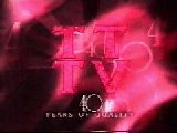
In 1999, Tyne Tees celebrated its 40th Anniversary. In celebration of this the Tyne Tees Graphics Department created this special "ruby" version of the current logo, with the distant sound of the original 1959 jingle for the soundtrack. A very nice ident that only lasted a week...
Run in use with the current ident is the latest ITV branding
package, the 1999 Generic Look. This Tyne Tees variant is standard
to all the versions of the Generic look, it has it's logo at the top, and
the text is in the "station" font.
New for Tyne Tees, ident no. 11, the stations tenth regular ident in 13 years. These latest idents from TTTV features images from its region. This ident is currently relegated to a "regional" position, due to the extended use of the ITV Generic 1999 look. Shame really, it would make a good, regular ident.
Spinning squares, and more generics; this is ITV1.
Tyne Tees look accustomed to being consigned in name to the bottom of the screen. Nothing new in this ident.
Can you make the franchisee's name any smaller. Small print was never this small... Other TYNE TEES sites With thanks to the following people for the use of their captured material on this page: Andrew Bowden (Tyne Tees Logo Page), Steve Hackett (Television Ark), James Edwards (TV World), Damien McCaughan (Round The Regions). 1993 Production image from Richard Bell. |
|









Current Comments
1 comments so far (Add Comment)The yellow TTTV logo that is joined up is a classic. Why they felt the need to seperate the letters in the 90's is beyond me.
I wonder what Bill Steel does now a days?
Bring Back Regional ITV!!!
Mike.
Posted by Mike Brown Radio Show on Friday, 13.06.08 @ 16:10pm | #1405